


What Makes a Good Logo? A Practical Evaluation Checklist


- How Does a Logo Influence First Impressions?
- Simplicity: Remove Detail That Gets in the Way
- Make the Logo Appropriate to the Brand
- Choose Colour in Context
- Blue: Consider Familiarity and Competition
- Red: Balance Visibility with Fit
- Black: Use Contrast and Restraint Deliberately
- Design for Longevity and Flexibility
- Conclusion
A logo helps customers identify the organisation behind a product, service or communication. Its contribution depends on more than attractiveness: the mark needs to be recognisable, appropriate to the brand and reliable in use. Understanding those qualities gives a business a stronger basis for evaluating design, without expecting the logo alone to generate sales or customer loyalty.
How Does a Logo Influence First Impressions?
People may first encounter a brand through its website, packaging, advertising or social presence. The logo is one of the cues that helps them connect that encounter to a particular business. Its design therefore belongs within a broader approach to branding and communication.
A mark can support an intended impression of expertise, approachability or premium quality. A poorly applied or unsuitable design may undermine that impression, even when the business performs well. Familiar brands such as Apple, Nike and Airbnb demonstrate how a mark can become associated with an organisation over time. That recognition results from repeated use and experience as well as from the design itself.
Simplicity: Remove Detail That Gets in the Way
Unnecessary complexity can make a logo difficult to interpret or reproduce, particularly in small applications. A coherent form gives people a clearer opportunity to recognise it.
The objective is to use enough detail to establish character without relying on effects or decoration that obscure the underlying mark.
A well-resolved, relatively simple design can support:
Quick identification
A memorable overall form
Reliable use in print and digital settings
Adaptation to different sizes
For additional design resources, Adobe provides a useful starting point. Simplicity should still be assessed alongside distinctiveness and relevance; minimalism is not a universal guarantee of effectiveness. Further material is available from Adobe .

Make the Logo Appropriate to the Brand
The mark should fit the organisation’s intended character and position. A visually attractive result may still be unsuitable for the business it represents.
A legal practice and a children’s entertainment brand, for instance, may need different approaches to lettering, colour and form. These decisions should follow the brief rather than rigid category stereotypes.
An appropriate identity helps establish coherent expectations. It does not need to illustrate the business literally, but it should avoid sending signals that contradict its offer or confuse the intended audience.
Choose Colour in Context
Colour can influence associations and help distinguish a brand. Its effect depends on context, contrast, category conventions, culture and a person’s experience. It is more useful to assess those conditions than to assign a fixed emotional meaning to each hue.
Blue: Consider Familiarity and Competition
Blue is common in sectors such as finance, technology and services, where it is often used to suggest composure or dependability. Its prevalence can also make a new identity less distinctive, so the full palette and competitive context matter.
Red: Balance Visibility with Fit
Red can create a strong visual emphasis and is used in many retail, food and advertising contexts. Whether it is appropriate depends on the brand, the surrounding design and the associations relevant to the audience.
Black: Use Contrast and Restraint Deliberately
Black can contribute to a restrained or premium expression, particularly in fashion and luxury settings. It also works across many other positions. The impression comes from the whole system, including typography, space, material and application.

Design for Longevity and Flexibility
A mark built entirely around a short-lived fashion may need revision sooner than one grounded in a clear brief and durable form.
Longevity does not mean refusing to update an identity. It means establishing a strong foundation that can evolve without losing all its recognition.
Practical flexibility is equally important. The logo may appear on websites, apps, business cards, packaging, signage and social profiles. Test it at actual sizes, in one colour and on relevant materials. A design that only works in a large presentation cannot meet those demands reliably.
The central purpose is effective identification and communication.
A well-designed and consistently applied logo can:
– Support a coherent first impression
– Express an appropriate level of professionalism
– Help audiences identify and recall the brand
– Develop associations through repeated encounters
– Provide a familiar cue when customers return. The business still needs to earn that return through the value and experience it delivers.

Conclusion
A successful logo combines a recognisable form, an appropriate character, considered colour and dependable performance across applications. Evaluate those qualities together rather than judging the design by appearance alone. Used within a coherent identity and supported by a credible offer, a logo can become a valuable recognition asset for the business.

Related articles
 Brand Guidelines: Keeping Advertising Consistent
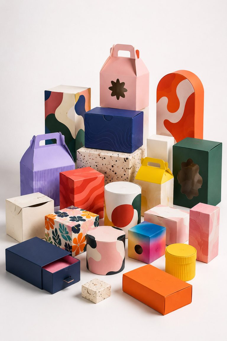 Packaging Design Trends: Practical Choices for Brands
Comments
No comments yet. Share your thoughts.